
- In this post, I’ll share a step-by-step guide on how I leveraged Google Antigravity and Gemini 3.0 model to modernize a mission-critical workflow.
- This React-based application prototype transforms raw epidemic signals into a seamless, interactive geospatial narrative, reimagining how we visualize global health intelligence.
Link to the application Global Outbreak Intelligence Hub and the Github repo
Step by step guide: Prompt engineering in Antigravity
In my first attempt, I manually drafted a Markdown file describing the app’s requirements. I navigated to Antigravity’s Agent Mode and tasked Gemini with reading the spec alongside sample CSV data to build the application from scratch. While the results appeared within minutes, the visual execution didn’t quite align with my vision.
For my second attempt, I refined my specifications and adopted a more strategic “prototyping” workflow:
- HTML Prototyping: I directed the agent to generate a static HTML file first. Since this is less energy-consuming than a full React build, it allowed for a rapid “review-and-tweak” loop to perfect the layout and UI.
- Stateful Logging: I instructed the agent to record every significant modification in a log.md file. This acted as a persistent memory, ensuring previous mistakes weren’t repeated as the project evolved.
- React Implementation: Once the prototype reached a satisfying level, I authorized the agent to build the final React.js application.
The result was magic - the agent delivered a high-fidelity app that exceeded my expectations. With the core architecture stabilized, I locked the specified functionalities, debugged, and added more features. Finally, I pushed the project to a GitHub repository and hosted it on Netlify, utilizing their agentic helpers to identify and resolve deployment nuances.
Key features of the app
Inspired by my work at the Taiwan CDC, this app modernizes the “Morning Intelligence Brief” by transforming manual PDF summaries into a dynamic, real-time geospatial dashboard. By providing immediate spatial context and intuitive risk assessment through interactive mapping, the application eliminates the information silos of traditional reporting. This approach democratizes sophisticated visualization, turning raw public health signals into a seamless narrative that empowers leadership and the public to respond to global health threats with unprecedented clarity.
Note: This is a static front-end demo. Data is fixed and not currently synchronized with live updates
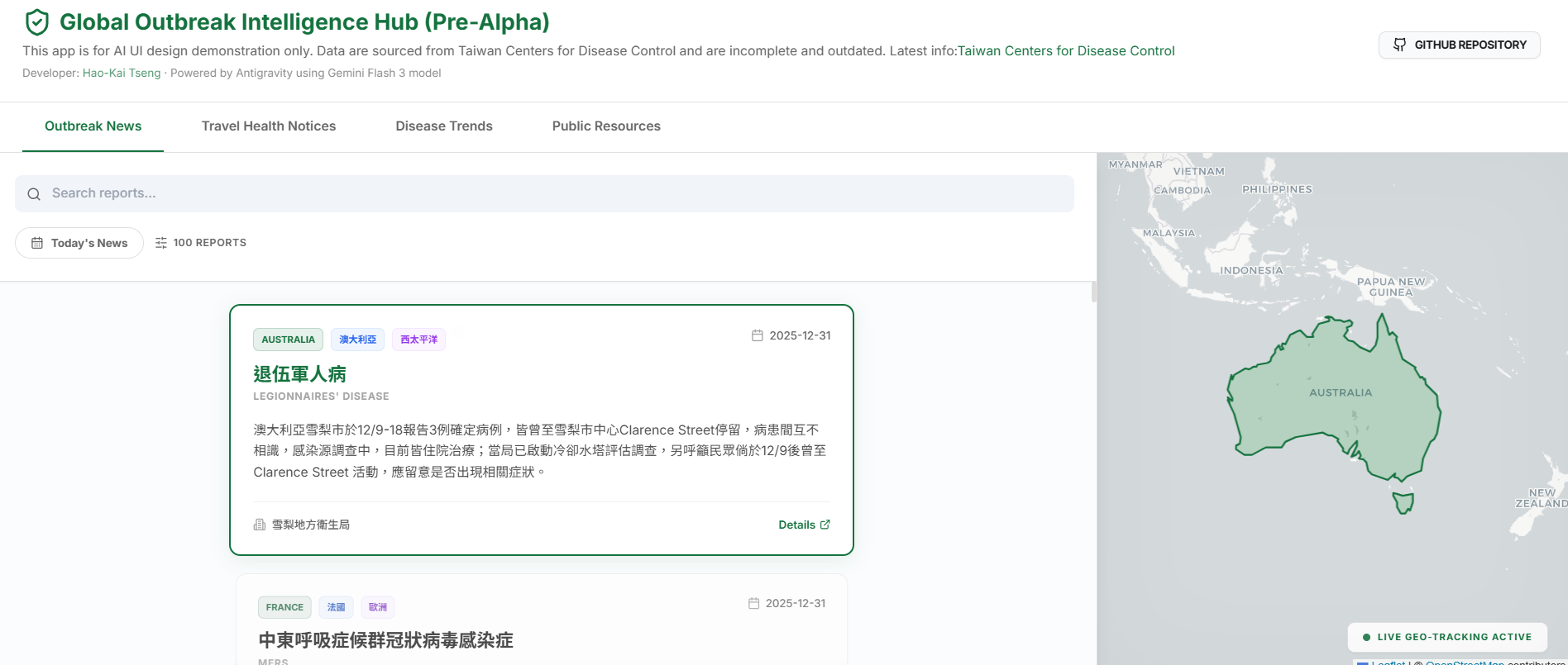
1. Outbreak News: Contextual Intelligence
An intelligence feed where global news reports are displayed in a dynamic vertical scroll.
- Geospatial Map Sync: Powered by the Intersection Observer API, the application detects exactly which news card is in view. As you scroll, the map automatically executes a
flyToanimation, centering and zooming on the reported country to provide instant geographic context. - Presentation Mode: Activate “Today’s News” to enter a focused briefing view. Navigate reports using Up/Down arrow keys or UI buttons for a seamless, slide-like experience.
- Full Intelligence Reports: Click any card to open a high-fidelity modal containing the full, non-truncated report.
2. Travel Health Notices: Visual Risk Assessment
This module transforms dry lists of travel warnings into an interactive visual risk-assessment tool.
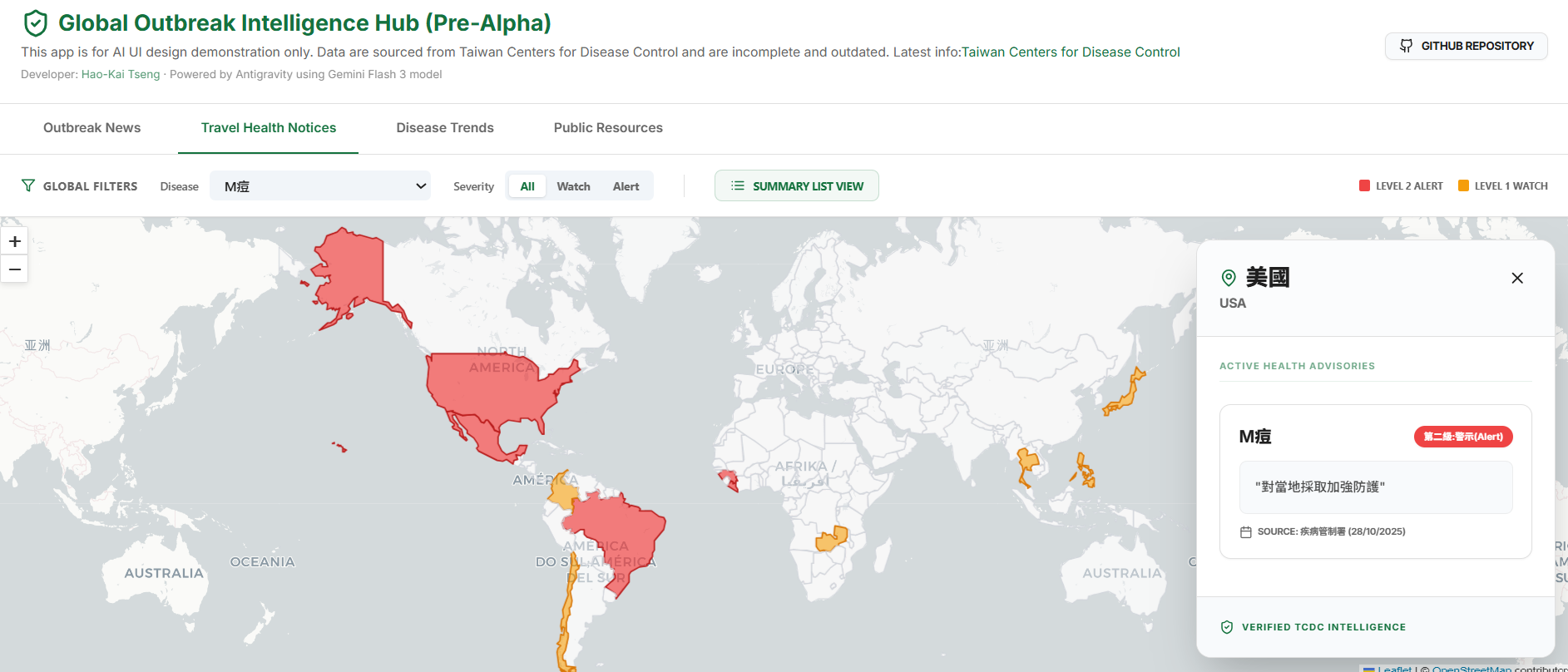
- Dynamic Risk Mapping: A choropleth map visualization where countries are color-coded based on TCDC severity (Level 1 Watch & Level 2 Alert).
- Interactive Details: Users can filter by disease or country. Clicking a country reveals a panoramic detail panel containing specific instructions, precautions, and reporting dates.
- Summary List View: A wide-format aggregated table that groups data by disease, allowing analysts to identify all affected regions for a specific pathogen at a glance.
3. Disease Trends: Deep-Dive Analytics
A longitudinal analytics dashboard focusing on major global pathogens like Cholera, Measles, and Polio.
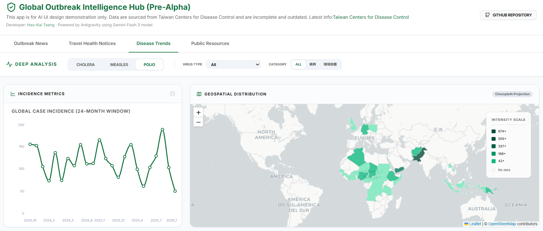
- Granular Data Filtering: I implemented specialized filters for complex datasets—such as Polio, where distinguishing between “case type” (wild vs. environmental) and “virus type” is critical for public health response.
- Multi-Metric Visualization: Switch between bar charts for outbreak magnitude and time-series line charts to track incidence trends over a 24-month window.
- Intensity Mapping: Dynamic choropleth maps visualize the global distribution and case density per country, handling thousands of data points without sacrificing UI responsiveness.
4. Public Resources
A curated directory of global health intelligence designed with a “Data-over-Decoration” mindset.
- Aesthetic & UI/UX: The project follows a minimalistic, bright, and modern design. I utilized glassmorphism effects to keep cards feeling lightweight and implemented restrained transitions to reduce cognitive load for health analysts.
- Searchable Resource Index: A verified directory of official portals (WHO, CDC, CIDRAP, ProMED) searchable by category or provider name.
Tech stack
- Frontend Core: React 19 powered by Vite for ultra-fast builds.
- Geospatial Engine: React-Leaflet with CartoDB Light Voyager tiles. I prioritized Leaflet for its flexibility in handling custom GeoJSON layers.
- State Management: Zustand. Given the high degree of coordination needed between a scrolling news feed and a background map, a lightweight global store was essential.
- Visuals & Motion: Tailwind CSS for layout and Framer Motion for smooth tab transitions and micro-animations.
- Data Visualization: Recharts for the “Disease Trends” analytics.
Views expressed here are my own and do not necessarily represent the views of my employer, the Taiwan Centers for Disease Control. This content was developed in collaboration with Gemini.