This post aims to advance your Power BI skills by:
- Creating a sequence of sustained measures in a new table, rather than having random measures co-existing with variables.
- Updating longitudinal data when new data is routinely received.
[Note that the data used in this post are examples, inspired by my work with the Immunisation Financing & Sustainability (IF&S) team at Gavi. The views expressed here are my own and do not represent those of my former employer, Gavi.]
Pain points
As a daily R user, it took me a few weeks to become handy with Power BI, a business intelligence solution that many global health organizations use to stimulate internal information. One of the pain points I encountered was that variables and created measures coexist under the same data but function quite differently. Let’s define the two:
-
Variable: The original value as imported. It can be seen in both table and report views. It is not recommended to be used directly for report view, as it does not interact with slicers.
-
Measure: Created using DAX language, it is marked with a calculator icon. An indivisual measure is attached to the variable and only appears in report view, being invisible in table views.
There are significant differences between variables and measures. Why does Microsoft arrange them together alphabetically, creating a disorganized mess? Even worse, each created measure may undergo similar data processing steps, such as transforming and filtering. Why are we redundantly working on this?
To address these problems, in this post, I aim to make measures all reside under the same data, similar to creating a new data frame in R. Additionally, there must be a way to enhance measures’ reusability so that Power BI can be used as a data cleaning and management platform.
There must be a way to enhance measures’ reusibility.
Setting the scene
Below are two hypothetical datasets, using the context from Gavi’s Co-Financing model:
Data A
- Each country runs several vaccine programmes.
- Each program has Co-Financing obligations in US dollars that must be fulfilled by the end of the year.
- Gavi and UNICEF jointly monitor payments against these obligations on a monthly basis.

Data B
- Based on data A, the Co-Financing obligations and payments are aggregated at the country level, with programme-level details removed.
- KPIs, e.g. percent paid and status text, are summarized for each country.
- A monthly snapshot is taken and appended to previous records.

In short, every month, when Gavi IF&S team get the new data (data A), it is processed into data B.
A new table that has everything
I promise to provide a table with all the measures that you need. Let’s break it into 4 steps:
Step 1
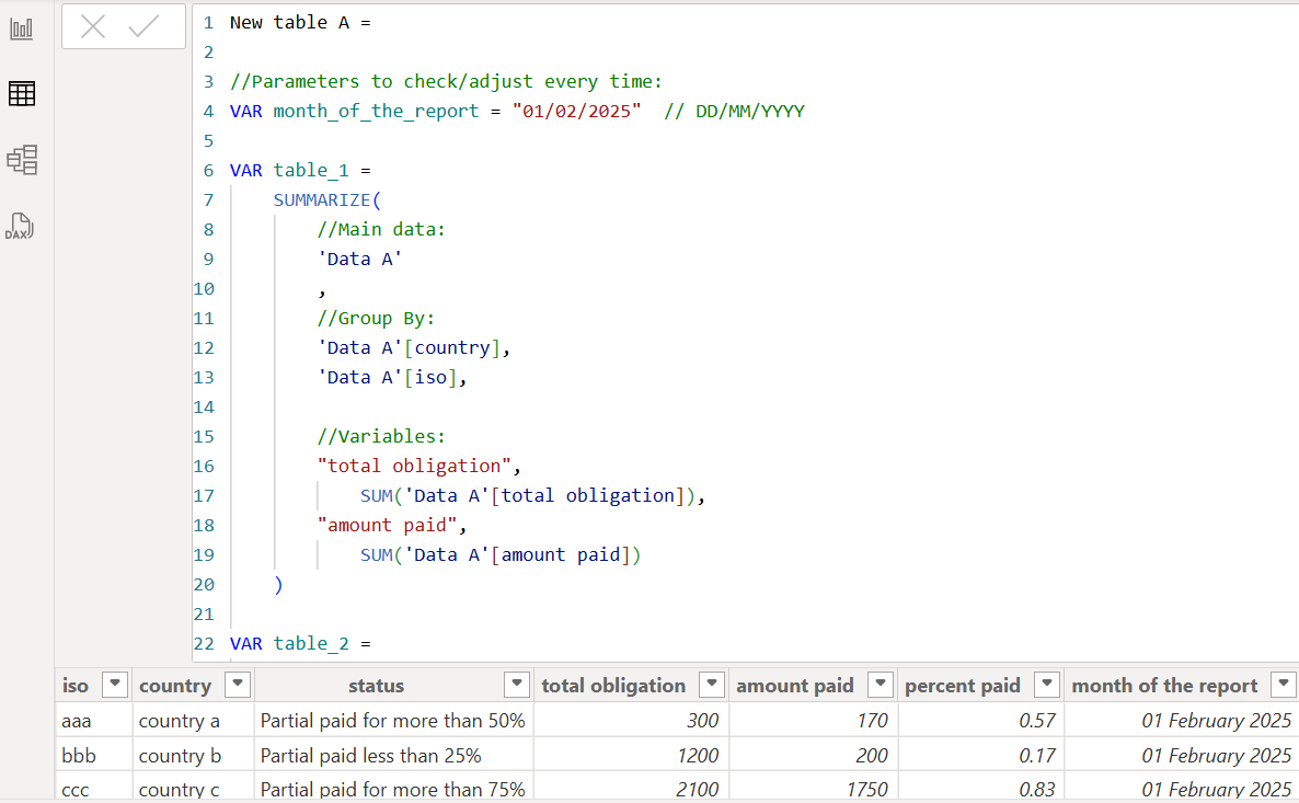
In Power BI’s Table View, navigate to the Calculations tab in the top panel and click the New Table icon. Then, write a DAX expression like the one below to create a new table called New Table A.
Here, we summarize two variables, total obligation and amount paid, by country name and iso code using data from Data A.
Note that this summarized information is temporarily stored as table_1 using the VAR function.
New table A =
//Parameters to check/adjust every time:
VAR month_of_the_report = "01/02/2025"  // DD/MM/YYYY

VAR table_1 =
    SUMMARIZE(
        //Main data:
        'Data A'
        ,
        //Group By:
        'Data A'[country],
        'Data A'[iso],

        //Variables:
        "total obligation",
            SUM('Data A'[total obligation]),
        "amount paid",
            SUM('Data A'[amount paid])
    )
Step 2
Following the DAX expression, we enter the DAX code below. This chunk directly utilizes the two measures created in table_1 in Step 1—[amount paid] and [total obligation]—rather than raw variables from Data A.
In other words, we reuse these measures to calculate the [percent paid] measure and temporarily store it in another VAR called table_2.
VAR table_2 =
    ADDCOLUMNS(
        table_1,
        "percent paid",
        ROUND( DIVIDE([amount paid], [total obligation]), 2) // ranging 0-1
    )
Step 3
Within the same DAX expression, we reuse the measure created in the previous step — [percent paid].
We then apply the SWITCH function to categorize [percent paid] into different levels, creating a new categorical measure called [status]. This [status] measure is temporarily stored in the VAR table_3.
VAR table_3 =
    ADDCOLUMNS(
        table_2,
        "status",
         SWITCH(
          TRUE,
          [percent paid] >= 1, "Fully paid",
          [percent paid] > 0.75, "Partial paid for more than 75%",
          [percent paid] > 0.5, "Partial paid for more than 50%",
          [percent paid] > 0.25, "Partial paid for more than 25%",
          [percent paid] > 0, "Partial paid less than 25%",
          [percent paid] = 0, "Not paid yet",
          "other"  )
    )
Step 4
In the final step, we use the RETURN function to output the information temporarily stored in VAR.
Since we need to generate a table, we also use the SELECTCOLUMNS function to extract the relevant measures.
Right after the SELECTCOLUMNS, You can adjust the text inside the brackets "" to rename your measures as needed.
RETURN
    SELECTCOLUMNS(
    table_3,
      "iso", [iso],
      "country", [country],
      "status", [status],
      "total obligation", [total obligation],
      "amount paid", [amount paid],
      "percent paid", [percent paid],
      "month of the report", month_of_the_report
)
Important Distinction: VAR vs. Measures
[status]is a measure (denoted by brackets[]), meaning it can be used in the Report View.month_of_the_reportis aVAR, which only exists temporarily within this DAX expression and is NOT available or accessible in Report View.
Below is the resulting table, New Table A, created through these four steps.

Updating on a monthly basis
Sanpshots
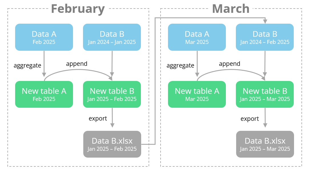
To update table B, we now need to take a snapshot of new table A and append it to table B. This can be easily done using the UNION function.
New table B = UNION('Data B', 'New table A')
Once new table B is updated, we should export the data from Power BI for historical record. In the Table view, right click the new table B, and paste the data into a blank excel file.
Updating from February to March
Suppose your Power BI is using February data, and you just received the March data A. Here’s how to update the data from February to March. The graph below illustrates the steps:

- Navigate to the File button in the top-left panel and click Options and settings.
- Select Data source settings.
- Select “data a February 2025.xlsx,” press the Change source button, and replace it with “data a march 2025.xlsx.”
- Select “data b January 2025.xlsx,” press the Change source button, and replace it with “data b February 2025.xlsx.”
- Go to the new table A’s DAX expression. Once the date for
month_of_the_reportis updated to “01/03/2025,” the snapshot for March will be automatically completed. - In parallel, new table B will also be updated, with March data appended.
- Export the new table B from Power BI.
Note that these steps use Change source rather than refresh function - as refresh only updates the original, fixed data source.
What do you mean by “self-sustained”?
In summary, the way the data is updated is self-sustained because:
-
In the new table A, measures are set to sustain its usage into next
VAR. This is beneficial for a set of order-sensitive measures that rely on the same filtering, thereby saving space by eliminating redundant filtering processes. -
All data processing steps for updating the new table B are carried out within Power BI, while also preserving a track record. In other words, this self-sustained process can continue autonomously once initiated, as long as new data is fed into it.
With these self-sustained concepts in the Table View, you can create fantastic visuals in Report view while ensuring concise, clear, organized, and less error-prone data management for routine tasks.
This self-sustained concepts align with my core values in data science: data efficiency, integrity, and reproducibility.
After working on this, I do feel developing a Power BI dashboard doesn’t mean low-code at all… Any thoughts?
| This DAX code was collaborated with Copilot. The wording in this post is refined by ChatGPT. Views expressed here are my own and don’t represent the views of my former employer, Gavi. |
