This post shares my work at the lovely Immunisation Financing & Sustainability (IF&S) team at Gavi, the Vaccine Alliance. Please note that views expressed here are my own and don’t represent the views of my employer, Gavi. It covers:
- Brief intro for Gavi’s Co-financing model
- 5 visual tips for portfolio management (some with R code), e.g. risk-assessment table and faceted pie
- An optimized data flow for a complex data ecosystem
What is Co-financing
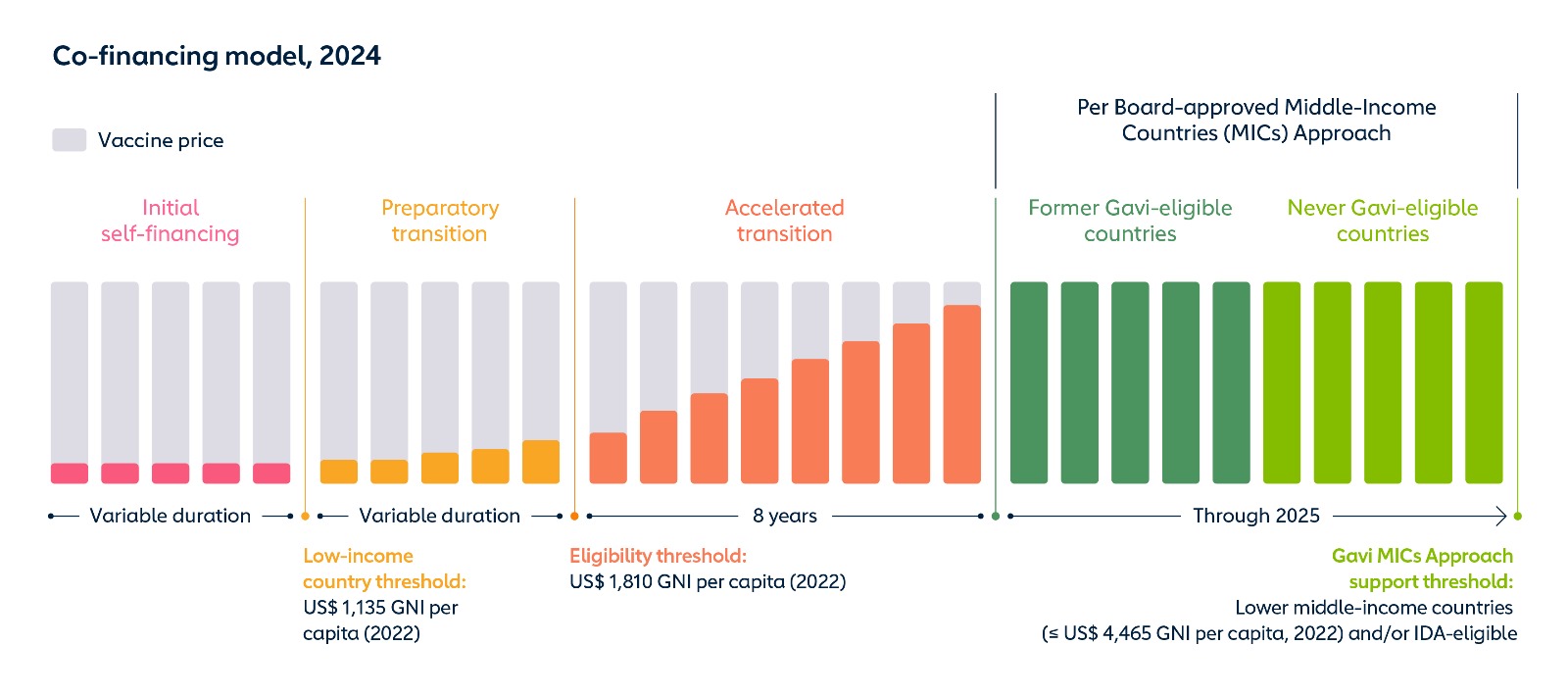
Under Gavi’s Co-financing policy, countries share the costs of the vaccine programmes by directly co-procuring a portion of the vaccines and injection devices from a supplier or procurement agency to fulfill their co-financing requirements. This policy, along with the Eligibility and Transition policies, aims to bring countries on a trajectory towards financial sustainability. The Co-financing level is associated a country’s capacity to pay, i.e. GNI per capita.
Each year, the primary objective of the Immunisation Financing & Sustainability (IF&S) team is to ensure that Gavi-implementing countries’ co-financing commitments are transformed into actual funding allocations.
- Externally, IF&S partners with 54 countries for immunisation budget planning, advocacy, and technical assistance, and resolve issues related to payment and transition.
- Internally, IF&S monitors monthly payment progress and identify at-risk countries for intensified engagement.
We believe every Co-financing dollar counts, empowering governments to take ownership of their vaccination programmes.
Managing a portfolio of US$ 200+ million
Take 2023’s Co-financing. Gavi has a large portfolio consisting of many kinds of vaccine products, e.g. PCV, HPV, and Penta. The portfolio’s Co-financing payments amounted US$ 215 million in 2023. It brought to US$ 1.7 billion countries total contribution since the introduction of the Co-financing policy in 2008.
It has become challenging to oversee such large scale of funding streams with an expanding portfolio. Close monitoring of countries’ co-financing status (Outstanding, Partially fulfilled, Fully fulfilled) is key to effective management.
Thanks to the power of analytics tools and routine practices, here are five methods that we used to get the jobs done: time series, risk table, facet pie, Alluvial/Sankey, and treemap.
1. Time series monitoring
We compare this year’s Co-financing progress with previous five years as KPIs. The KPIs can be absolute dollar paid or number of countries (partially) fulfilled.
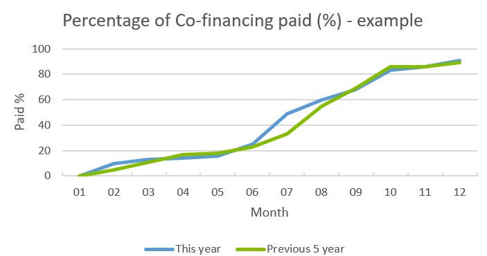
Timing is a critical factor for Co-financing. For two reasons:
- For countries using calendar years, 31 December is regarded as their deadlines. If countries don’t take Co-financing seriously, they could be chronically late payer.
- The co-financed vaccine doses will be shipped and delivered once the co-financing payment is made. In other words, no pay, no gain. Delayed payments may result in vaccine stockouts if the stockpile is lower than the consumption threshold.
No pay, no gain!
2. Risk assessment table
| Country | Co-financing obligations | Co-financing paid | Share of paid | Co-financing remaining | Co-financing status | Risk | Actions | Next steps |
|---|---|---|---|---|---|---|---|---|
| Country A | $200 | $196 | 98% | NA | Fully fulfilled | No risk | The country has met on doses according to UNICEF’s cost estimate. | Weekly coordination meeting with the country. |
| Country B | $100 | $80 | 80% | $20 | Partially fulfilled | Medium risk | Reminding letter has been sent. | High level meeting |
This table dives into the individual countries, combining qunatative and qualitative data for Co-financing. Since there are serious implications of defualting, i.e. not fully fulfilled, we use this table with another detailed monitoring table (not shown here) to assess which countries/antigens remaining unpaid.
-
Coutnry A: Why the country only paid 98% but considered fully fulfilled? This is because the country has procured all the required co-financed vaccine doses. There is often a difference between the Co-financing obligation dollars (estimated by Gavi) and the cost estimate (provided by UNICEF or PAHO as the procurement channel). Changing freight costs and insurance are the contributing factors to the cost gap.
-
Country B: For countries that still have outstanding antigens to be paid, Gavi sends an official letter to remind them of the remaining amount. Additionally, a higher-level meeting may be arranged with the Ministry of Health or Ministry of Finance to understand the fiscal space and nudge the transaction. Opening windows of communication is crucial, as common reasons for outstanding payments include macroeconomic headwinds, government political transitions, and fragile or humanitarian contexts.
Qualitative data aids in assessing the probability of successful Co-financing payment for the portfolio.
3. Faceted pie charts for portfolio composition
To fully understand the portfolio picture, it is helpful to visualize the Co-financing by country and by antigens.
This can be achieved using the facet_grid() argument in ggplot2, allowing people to quickly identify which vaccines are available in each country.
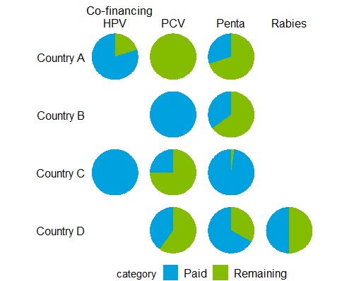
Additionally, generating pie charts with multiple categorical components can aid in understanding the share of each component. For example, in the context of Co-financing, two colors can be used to represent the paid amount and the remaining amount.
ggplot(data,
       aes(x = "",
           y = cost_normalized,
           fill = category)) +
  geom_col() +
  coord_polar(theta = "y")+
  facet_grid(country ~ vaccine,
             switch = "y")+
  theme_void()
4. Alluvial / Sankey diagram for multi-level streams
Alluvial and Sankey diagrams are a type of flow diagram showing changes in group composition between category fields. The thickness of each stream indicates its proportional value. These diagram can help us digest:
- Co-financing amounts by antigen and Co-financing amounts by funding sources. The funding sources can be directly domestic, UNICEF’s special mechanism, external (e.g. World Bank)
- A country’s linking chain of GDP, GGE(General Genvernment Expenditure)-GDP, GGHE(General Government Health Expenditure)-GGE, immunisation-GGHE.
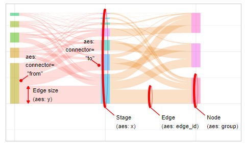 Graph credit:
 ggsankeyfier package
5. Treemap for landscaping
A treemap is an excellent way to demonstrate relative quantities and categories simultaneously. By building upon your self-defined groups, e.g. from 1 to 4 in the graph below, it can be strategically used to select a subset of data, determining the scope of the portfolio optimasation or strategy that you would like to work on.
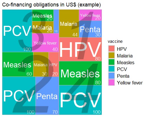
library(treemapify)

ggplot(data,
       aes(area = cost,fill = vaccine,label= vaccine,subgroup = factor(flag))) +
  geom_treemap()+
  geom_treemap_text(colour = "white",place = "centre",size = 15,grow = TRUE)+
  geom_treemap_text(aes(label = cost),colour = "white",place = "bottomright",size = 13,alpha = 0.8) +
  geom_treemap_subgroup_text(place = "centre",grow = TRUE,alpha = 0.25,colour = "black",fontface = "italic")
Optimizing data flow for a complex data ecosystem
The majority of the tasks at Gavi are built and transfered on Microsoft Office applications, such as Excel and PowerPoint. To make your data life easier and less manual, it is essential to bridge across different data processing steps, including:
- Data sources: Salesforce, SAP, emailed Excel files, websites (e.g. WHO API)
- Saved raw data: often in Excel format or CSV format
- Programming tool for data processing: R (studio) for cleaning and analytics
- Intermediate: cleaned file in Excel format or RData
- Dashboard: in interactive Power BI
- Presentation: using static or live-embedded graphics from Power BI for PowerPoint deck
- Publishing: in paramaterized Quarto report or Power BI pagenated report
- Deliverabels: graphics in PNG file produced from R, or inside Excel
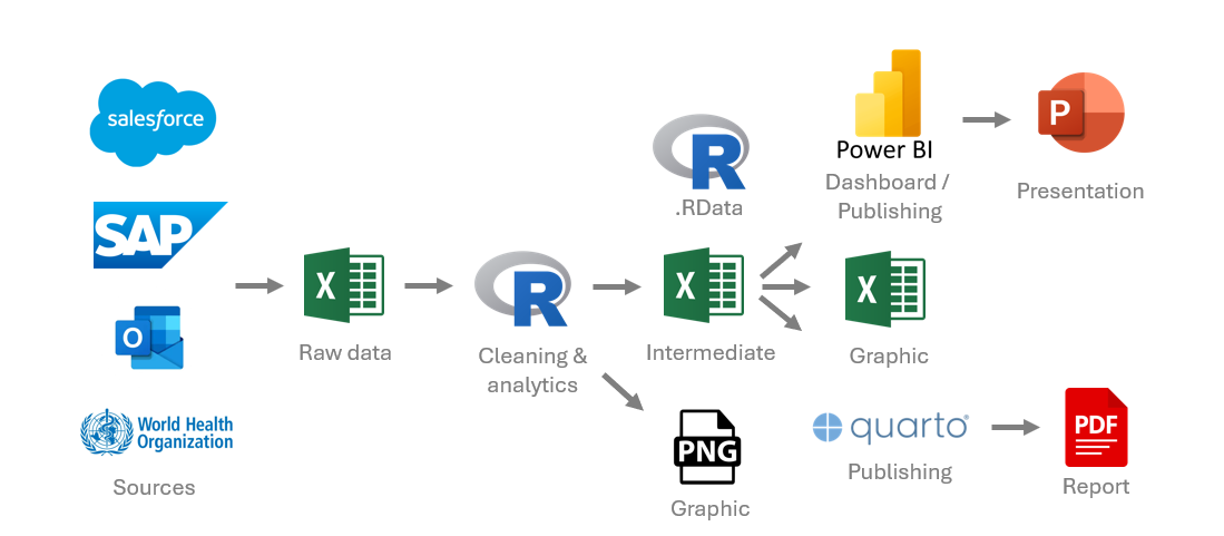
I’ve applied my Extract, Transfrom, Load (ETL) skills in a previous post at LSHTM. This time at Gavi, the challenge is more complex. To optimize the data flow, concepts for reproducibility and interoperability should be the focus, along with simplicity. Using R as a centralized programming deployment can improve efficiency, ensure consistency, minimize maintaince efforts while dealing with frequent portfolio changes. Notably, building the connection between Power BI and PowerPoint can dramatically save time, where the data flow can be integrated in Power BI itself.
To make your data life easier and less manual, it is essential to bridge across different data processing steps.
Additionally, this data flow can be used for continuous improvement of operational processes, as data can be collected from SAP sources, consumed into R, and presented in Power BI/Powerpoint visuals.
| I thank my supervisor Anthony Nguyen for building up the foundation for this post and for his pioneering insights. Yet, I am still exploring how to integrate AI as a text summarizing tool for qualitative data in this pipeline. Views expressed here are my own and don’t represent the views of my employer, Gavi. |
